library(abn)
#> abn version 3.1.9 (2025-06-26) is loaded.
#> To cite the package 'abn' in publications call: citation('abn').
#>
#> Attaching package: 'abn'
#> The following object is masked from 'package:base':
#>
#>     factorial
In this vignette, we will simulate data from an additive Bayesian network and compare it to the original data.
Fit a model to the original data
First, we will fit a model to the original data that we will use to
simulate new data from. We will use the ex1.dag.data data
set and fit a model to it.
# Load example data
mydat <- ex1.dag.data

# Set the distribution of each node
mydists <- list(b1="binomial",
                p1="poisson",
                g1="gaussian",
                b2="binomial",
                p2="poisson",
                b3="binomial",
                g2="gaussian",
                b4="binomial",
                b5="binomial",
                g3="gaussian")

# Build the score cache
mycache <- buildScoreCache(data.df = mydat,
                           data.dists = mydists,
                           method = "bayes",
                           max.parents = 4)
#> Warning: package 'INLA' was built under R version 4.5.0
#> Loading required package: Matrix
#> This is INLA_25.06.07 built 2025-06-11 18:54:45 UTC.
#>  - See www.r-inla.org/contact-us for how to get help.
#>  - List available models/likelihoods/etc with inla.list.models()
#>  - Use inla.doc(<NAME>) to access documentation

# Structure learning
mp.dag <- mostProbable(score.cache = mycache)
#> Step1. completed max alpha_i(S) for all i and S
#> Total sets g(S) to be evaluated over: 1024

# Estimate the parameters
myfit <- fitAbn(object = mp.dag)

# Plot the DAG
plot(myfit)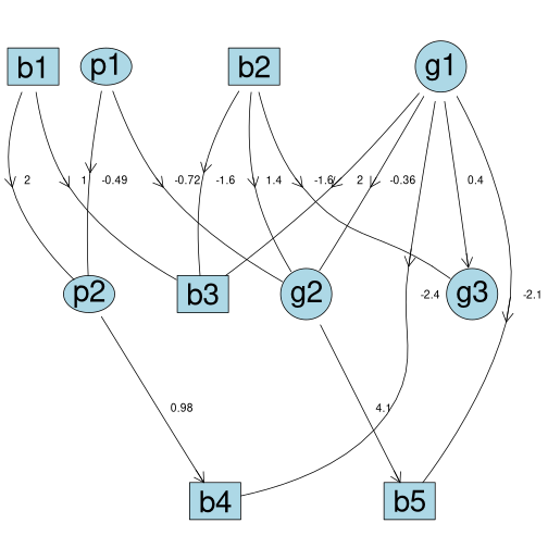
Simulate new data
Based on the abnFit object, we can simulate new data. By
default simulateAbn() synthesizes 1000 new data points.
mydat_sim <- simulateAbn(object = myfit)
str(mydat_sim)
#> 'data.frame':    1000 obs. of  10 variables:
#>  $ b1: Factor w/ 2 levels "0","1": 2 2 2 2 2 2 2 2 2 2 ...
#>  $ b2: Factor w/ 2 levels "0","1": 1 1 1 1 2 1 1 2 2 2 ...
#>  $ b3: Factor w/ 2 levels "0","1": 2 1 2 1 1 1 2 1 2 2 ...
#>  $ b4: Factor w/ 2 levels "0","1": 2 2 2 2 2 2 2 2 2 2 ...
#>  $ b5: Factor w/ 2 levels "0","1": 2 2 2 2 2 2 1 2 2 2 ...
#>  $ g1: num  0.796 -0.92 0.167 -2.602 -0.432 ...
#>  $ g2: num  0.112 -0.708 -1.621 0.115 1.504 ...
#>  $ g3: num  0.703 -0.891 0.206 -0.55 -1.458 ...
#>  $ p1: num  0 1 1 0 0 0 1 0 1 0 ...
#>  $ p2: num  17 7 6 16 9 12 7 9 5 9 ...
In the background, the simulateAbn() function translates
the abnFit object into a BUGS model and calls the
rjags package to simulate new data.
Especially for debugging purposes, it can be usefull to manually
inspect the BUGS file that is generated by simulateAbn().
This can be done by not running the simulation with
run.simulation = FALSE and print the BUGS file to console
with verbose = TRUE.
# Simulate new data and print the BUGS file to the console
simulateAbn(object = myfit,
            run.simulation = FALSE,
            verbose = TRUE)
To store the BUGS file for reproducibility or manual inspection, we
can set the bugsfile argument to a file name to save the
BUGS file to disk.
Compare the original and simulated data
We can compare the original and simulated data by plotting the distributions of the variables.
# order the columns of mydat equal to mydat_sim
mydat <- mydat[, colnames(mydat_sim)]
library(ggplot2)
library(gridExtra)

# Create a list of variables
variables <- names(mydat)

# Initialize an empty list to store plots
plots <- list()

# For each variable
for (i in seq_along(variables)) {
  # Check if the variable is numeric
  if (is.numeric(mydat[[variables[i]]])) {
    # Create a histogram for the variable in mydat
    p1 <- ggplot(mydat, aes(!!as.name(variables[i]))) +
      geom_histogram(binwidth = 0.5, fill = "skyblue", color = "black") +
      labs(title = paste("mydat", variables[i]), x = variables[i], y = "Count") +
      theme_minimal()

    # Create a histogram for the variable in mydat_sim
    p2 <- ggplot(mydat_sim, aes(!!as.name(variables[i]))) +
      geom_histogram(binwidth = 0.5, fill = "skyblue", color = "black") +
      labs(title = paste("mydat_sim", variables[i]), x = variables[i], y = "Count") +
      theme_minimal()
  } else {
    # Create a bar plot for the variable in mydat
    p1 <- ggplot(mydat, aes(!!as.name(variables[i]))) +
      geom_bar(fill = "skyblue", color = "black") +
      labs(title = paste("mydat", variables[i]), x = variables[i], y = "Count") +
      theme_minimal()

    # Create a bar plot for the variable in mydat_sim
    p2 <- ggplot(mydat_sim, aes(!!as.name(variables[i]))) +
      geom_bar(fill = "skyblue", color = "black") +
      labs(title = paste("mydat_sim", variables[i]), x = variables[i], y = "Count") +
      theme_minimal()
  }

  # Combine the plots into a grid
  plots[[i]] <- arrangeGrob(p1, p2, ncol = 2)
}
The plots show that the distributions of the original and simulated data are similar.